Monday 22 October 2018

The Udderly Perfect Stool at Krause Berry Farms


Puns have never been my thing, but this stool is udder perfection! I caught a glimpse of this work of art during my recent jaunt to Krause Berry Farms. It lives behind their wine bar, but as soon as it caught my eye, I could not resist the having an impromptu photo shoot inside Krause Berry's Wine Tasting Room. 

The staff probably thought I was weird, but come on, it is a spotted cow stool WITH PINK UDDERS. Yes, underneath the stool are four glorious pink teats. I tried to keep my pictures nonchalant; however, deep down inside I just wanted to perch on top and pretend to "milk" it. Super classy! 


I was not planning on writing a post about a hand-painted wooden stool that for the most part gets used as a step stool to reach wines from the top shelf. I had posted a picture to Instagram and to my udder - keeping the puns going - disbelief, everyone loves the stool too! Did I mention that this stool is one of two, the second is smaller; however, it too is painted to resemble a cow and features pink udders! 


Unfortunately Krause Berry Farms does not sell these stools. As I had mentioned earlier, this stool lives behind the wine bar, so most patrons never see it. I am a frequent guest at Krause Berry Farms and I too only saw it for the first time a few weeks ago. I do recall seeing a tag on the underside of the stool and the PR team is looking into getting some more to sell in their market as a lot of you showed a great deal of interest in purchasing one. Fingers crossed that they are able to locate the artist, so we can all have our very own milk cow udder stools because no home is truly complete without one. 

BYES

Thursday 18 October 2018

Charlotte Tilbury Lipsticks and Lip Liners


I am by no means a beauty guru and honestly consider myself to be an average young adult in Vancouver. I have a fairly simple relationship with makeup. I pull it out for special occasions, but for the most part, I am au natural. So when I do purchase makeup, I usually splurge on higher-end brands. 

A good lipstick can give you a pretty pout, but a great lipstick can transform your entire look. Charlotte Tilbury lipsticks happen to fall in the latter category making its high price point justifiable. At $55 a tube, Charlotte Tilbury falls into the luxury makeup category. I feel the brand has only recently come into the mainstream. In fact, Charlotte Tilbury was picked up by Sephora a mere few months ago! Prior to that, in Vancouver I could only find it at Holt Renfrew and Nordstrom, two of the worlds biggest luxury brand retailers. 

Their lipsticks are packaged in a lovely metallic copper-hued tube with ridges and the logo stamped on top of the lid. These lipsticks definitely stand apart amongst the sea of black packaging that we usually see. 

Last year I had picked up Secret Salma and Penelope Pink, two neutral everyday shades that I have come to adore and love. Honestly, I have used a fair bit of the Secret Salma stick because it makes even an everyday look more polished. This year I have gone with bolder hues, a bright coral pink named Lost Cherry and a dramatic deep plum that goes by the name Hel's Bells

When I hear Lost Cherry, I think red, but this lipstick is actually an orangey-pink coral tone with a matte finish. Definitely not a bright red. Aside from the misleading name, its a fun colour that reminds me of spring and summer. It would go well with a  natural look and rosy cheeks. I cannot wait to rock it in 2019. The best part, though being matte, it does not sacrifice moisture making it comfortable to wear. 

Hel's Bells is the complete opposite of Lost Cherry. The deep plum purple is super vampy and does wonders for my complexion. I cannot help, but feel sexy when wearing it. This too is a matte finish and is comfortable all day long. I have always loved berry coloured lipsticks, so it goes without saying that I am elated to finally own one! Perhaps its an extension of my immense love for fresh berries - Strawberries and Raspberries! 

As I mentioned earlier, I did get two lip liners, which are completely new to me. Walk of Shame is the reddish tone while Love Trap is a darker nude brown colour. As the name implies, it is used to define the shape of your lips before applying your lipstick of choice. Unlike the lipsticks, the lip liners are very firm, making them hard to apply. Granted, I honestly have never used a lip liner before in my life, so maybe all lip liners are like that? I probably will not be exploring the world of lip liners and with these two shades in my collection, I can pretty much pair them with any lipstick. 

All of their lipsticks have fantastic pigmentation and are seriously long lasting. I am a lazy person and am infamous for never touching it up, so I need something that is going to last me through an event and eating and drinking. They almost "stain" your lips, which is why even after vigorously rubbing my arm under warm water, you could still see the colour. 

With the days getting cooler and leaves steadily piling up at the base of trees, I certainly see myself donning my new dark berry shade, Hel's Bells more and more. 

BYES


Monday 1 October 2018

Attending Interior Design Show Vancouver 2018 as a VIP

Over the course of 4 days, some of Vancouver's most creative minds were all under one roof for the Interior Design Show (IDS) Vancouver. This was my third year attending, but unlike in the past, this time I got to go to the private media cocktail party. I got to walk the floor with an exclusive VIP lanyard around my neck and explored the exhibition during the private cocktail hour on Thursday evening. That fancy lanyard of mine also granted me access to the exclusive VIP lounge. 

For the cocktail party, I donned an emerald green lace dress from Aritzia which I paired with black leather Rachel Comey booties. I thought I looked pretty amazing, yet I still could not help, but feel a little underdressed. I was surrounded by gorgeous people decked out in the most fabulous fashion forward outfits. Needless to say, I was living for their outfits. 

During the closed cocktail party, food stations were dispersed around the large space. There were platters of fine cheeses with artisanal crackers, sushi, spring rolls, mini sliders and of course free flowing red and white wine. Since it was around dinnertime, I found myself scouring the floor for food and only after I settled my hunger pangs did I start exploring the actual show. 

IDS Vancouver held its first exhibition in 2004 and nearly a decade and a half later, IDS Vancouver has exponentially grown into Western Canada's largest celebration of design. The show is diverse and nearly a third of the exhibitions were by local designers and artisans. The show featured panelists, abstract art installations, and the newest trends in home decor. 


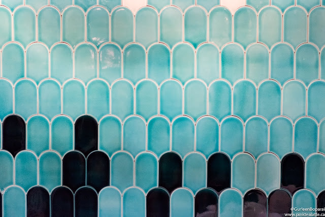
My favourite part of the show each year is the conceptual space challenge. For 2018, eight designers were asked to re-imagine the bathroom as a sanctuary. The theme was Retreat and each of the 100 square-foot conceptual spaces were distinctly unique, echoing the designer's style. As with every year, this corner of the convention hall was insanely busy. My favourite bathroom which unsurprisingly also won Best Exhibit Space was a collaboration between Annaliesse Kelly ID Studio and Madeleine Design Group Inc. The wall behind the bathtub was a stunning blue to white ombre of scalloped tiles that screamed mermaid. The space was also framed by a unique laser cut design. Another bathroom was grand and featured rich gold and copper tones and even had stairs leading up to it. I also really enjoyed Kendall Ansell Interior's blue ad mustard hued bathroom that had a macrame swing and wicker baskets. 

For some weird reason, September was cursed for me because everything I touched seemed to break. My SD card decided to become corrupted, which means I was not able to retrieve a huge proportion of my pictures from the night which is a bummer because the Altered States exhibition by Caesarstone and Snarkitecture was a stunning interactive piece of art and a real focal point of the night. The different layers really gave it a lot of depth and was fun to pose on. Sigh my pictures :( Good thing everyone there was taking a lot of pictures that they posted to Instagram under the hashtag: #idsvancouver. 


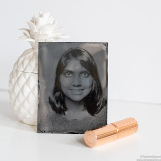
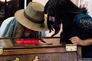
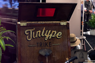
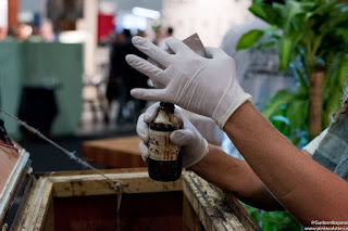
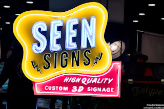
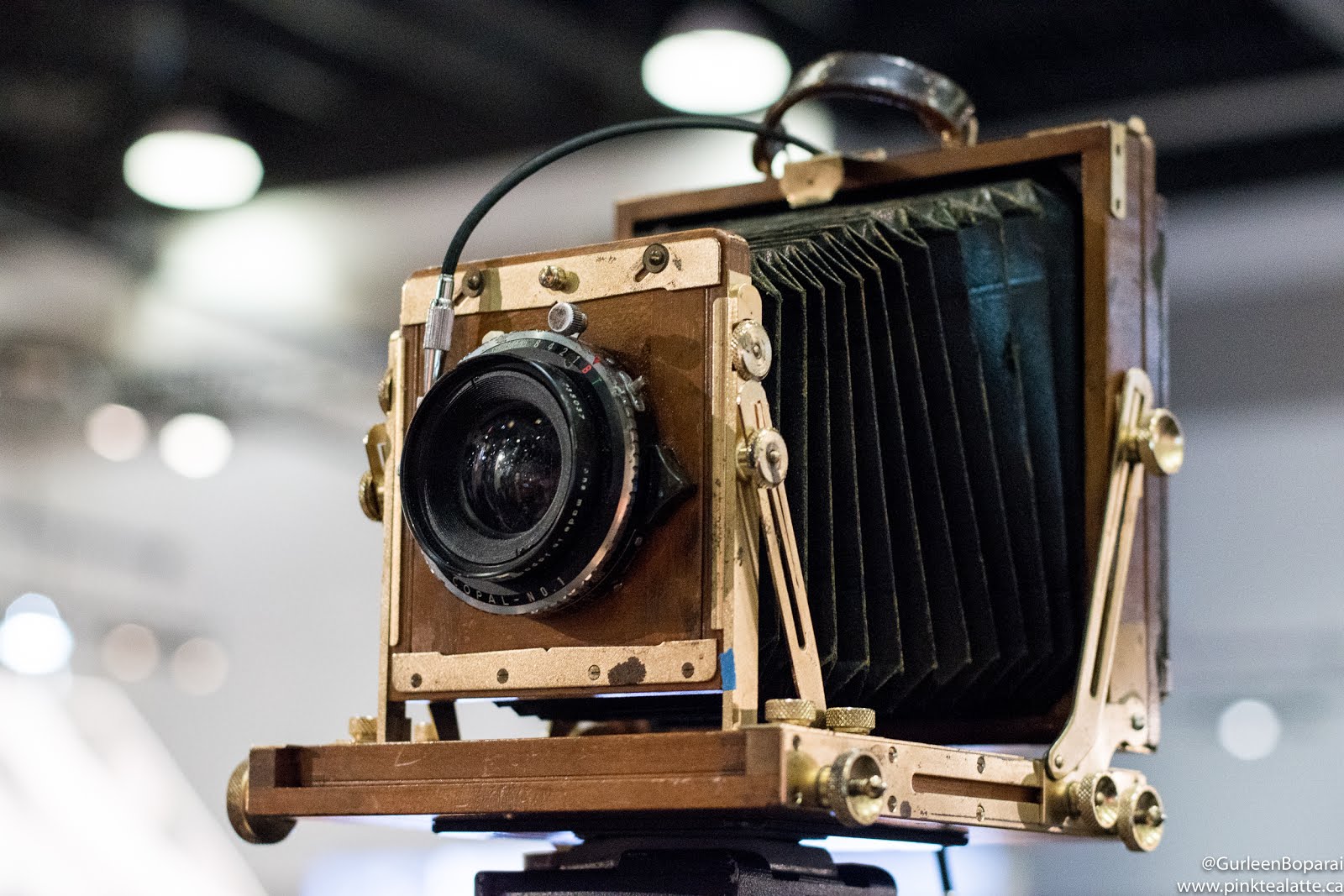
Before the night was up, it was my turn to sit and look pretty for photographer Ian Azariah. He was there for the night of the Media party with Seen Signs and was photographing guests with an 1860's method called Tin Type. With a  little bit of science and of course magic, he fused particles of real silver onto a metal plate in his make shift darkroom on the back of a trike. The image development was really freaky because the image first starts as an inverse and slowly changes into the final picture. I swear he is a sorcerer and since I smiled in the picture, I fear he has captured my soul! 

The resurgence of Mid-Century Modern furniture is real and I could not be happier because I am living for the solid walnut and teak furniture. I find those woods have a lovely warm orange tone that makes spaces feel cozy. I hope to someday furnish my own future home with furniture in this style. Did you know Teak wood is the hardest wood and is currently one of the most expensive types of wood. 

The night went by so fast that it feels like a blur. I do not think I have had this much fun at an event before! Thank you so much for having me IDS Vancouver and I look forward to celebrating design with you next year. 

BYES